I don’t know about you, but I have a love-hate relationship with camera-gear talk. As much as I love gathering information about lenses and camera bodies, I also detest the thought that my gear is not good enough, even after spending a whole lot of money. It makes me and my bank account very sad. :(
While good camera gear helps add magic to photos, it only represents half the challenge (I mean, you don’t see us bringing little point-and-shoot cameras to our clients’ events!). Having an idea on how to compose a good image is key to a great shot, no matter the gear.
Since the year-end holidays are near and you will probably be traveling, I will show you some basic composition rules to help make your holiday shots better!
1. Rule of thirds

No, we’re not playing tic tac toe. :P
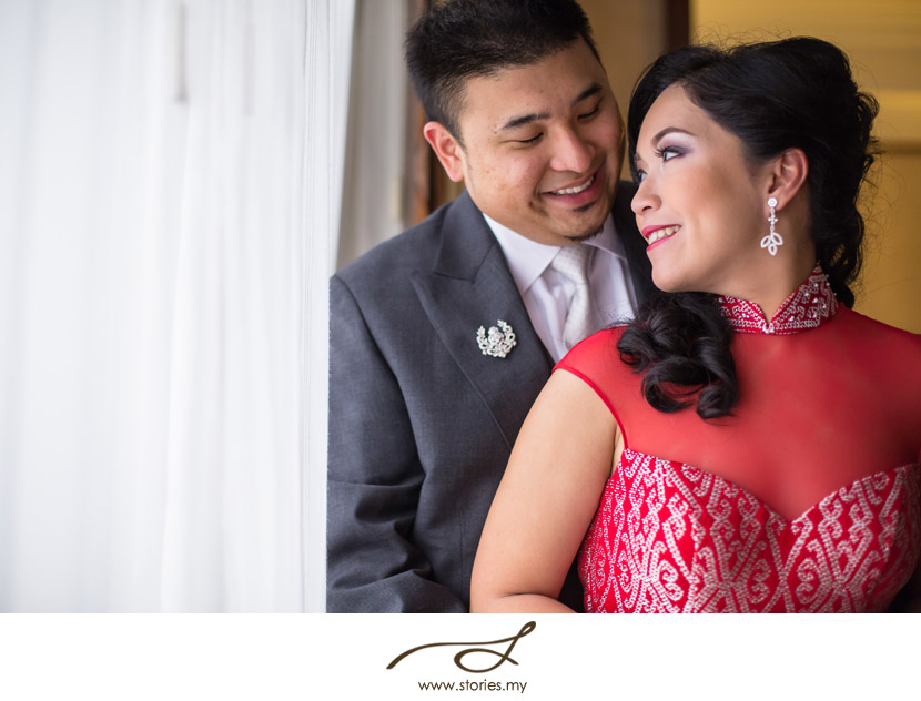
You’ve probably seen this grid in your smart-phone cameras. This is one of the most useful feature that you can have as it helps you align your horizon.
The other use for this is as a guide to place your subject at the points of interest, which are the points where the lines cross. Our eyes are drawn to these points, creating a pleasing photo.
2. Look for a clean background
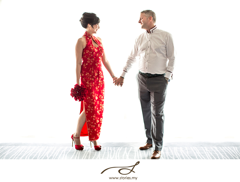
Your choice of background matters! A photo with a busy background will have less impact as our eyes are distracted from the subject. Also, make sure that nothing ‘grows’ or sticks out of your subject’s head. At a wedding recently, I made the groom look like he had antlers when I unknowingly placed him directly in front of a set of deer antlers that were hanging on the wall. I won’t show you the shot because I am shy about it. :P But here’s an example of a shot that has good, clean background.
3. Point of view
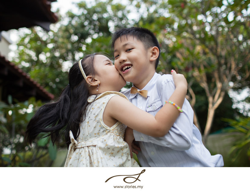
Play with angles- go high or low! Sometimes what we often see at our eye level can get a little boring, at least for me. So to make your shot seem more interesting, try taking it from a different point of view. However, be careful about using this on portraits- a high angle will accentuate the height of one’s forehead, while a low shot will accentuate the subject’s chin. Knowing this can work well to your advantage. If someone has a prominent double chin, taking a shot from a slightly higher vantage point can make the double chin miraculously disappear! A low angle worked well for this shot of Joy-Anne and her brother, Joseph. This shot would have lost its impact if it was taken from an adult’s POV.
4. Leading lines
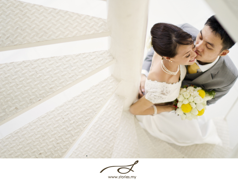
Our eyes are drawn to lines, so use this to your advantage to lead them to your subject. In the shot below, the spiral staircase lead our eyes to Justin & Audrey.
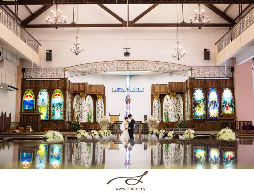
5. Symmetry and patterns
Repeating patterns are very eye-catching and attention grabbing. They are great for architectural photography. You can also use this for portraits as well.
I hope with these simple guidelines you would be able to take better pictures. Remember, skill matters. ;)
Have fun!

The picture is an awesome composition.The reflection does the magic.